R语言--obama_vs_mccain数据集示例&数据可视化
library(learningr)data("obama_vs_mccain")obama<-obama_vs_mccain$Obama#统计函数range(obama)median(obama)table(cut(obama,seq.int(0,100,10)))mad(obama)cumsum(1:10)#累积和cumprod(1:10)#阶乘quantile(obama)#分位数qu
·
library(learningr)
data("obama_vs_mccain")
obama<-obama_vs_mccain$Obama
#统计函数
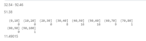
range(obama)
median(obama)
table(cut(obama,seq.int(0,100,10)))
mad(obama)
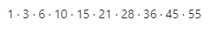
cumsum(1:10)#累积和
cumprod(1:10)#阶乘

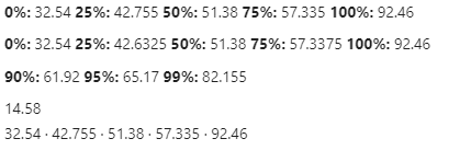
quantile(obama)#分位数
quantile(obama,type=5)
quantile(obama,c(0.9,0.95,0.99))
IQR(obama)
fivenum(obama)
summary(obama)
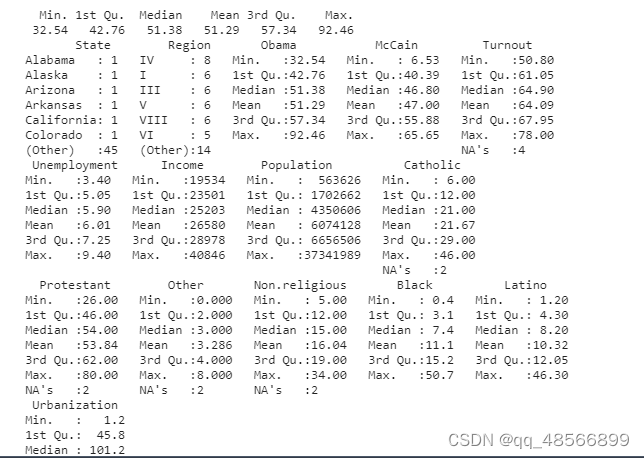
summary(obama_vs_mccain)
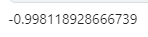
with(obama_vs_mccain,cor(Obama,McCain))#相关系数
数据可视化
https://r4ds.had.co.nz/exploratory-data-analysis.html
1.判断变量类型
2.如果是分类变量就用条形图,饼图
3.美化
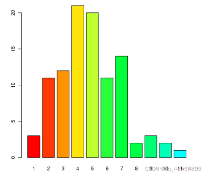
# 可视化
require(grDevices)
tN<-table(Ni<-stats::rpois(100,lambda=5))
r<-barplot(tN,col=rainbow(20))#条形图用于分类变量
line(r,tN,type='h',col='red',lwd=2)
barplot(tN,space=1.5,axisnames=FALSE,sub="barplot(...,space=1.5,axisnames=FALSE)")
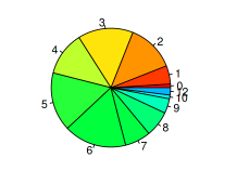
require(grDevices)
tN<-table(Ni<-stats::rpois(100,lambda=5))
pie(tN,col=rainbow(20))
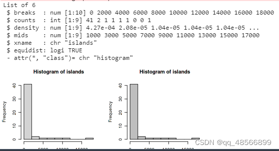
op<-par(mfrow=c(2,2))
hist(islands)
utils::str(hist(islands,col='gray',lables=TRUE))
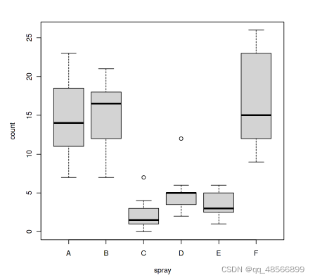
boxplot(count ~spray, data=InsectSprays,col='lightgray')#箱线图
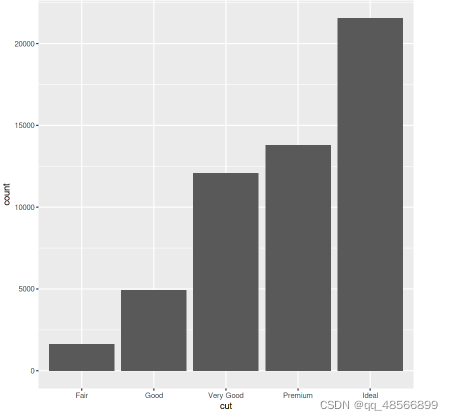
ggplot更加智能,能够自动的分组,且美化。https://r4ds.had.co.nz/exploratory-data-analysis.html
library(tidyverse)
ggplot(data = diamonds) +
  geom_bar(mapping = aes(x = cut))

魔乐社区(Modelers.cn) 是一个中立、公益的人工智能社区,提供人工智能工具、模型、数据的托管、展示与应用协同服务,为人工智能开发及爱好者搭建开放的学习交流平台。社区通过理事会方式运作,由全产业链共同建设、共同运营、共同享有,推动国产AI生态繁荣发展。
更多推荐


 0
0 0
0- 0


 已为社区贡献2条内容

所有评论(0)