第14天-Matplotlib实现数据可视化
Matplotlib是Python最基础的数据可视化库,提供类似MATLAB的绘图接口,支持2D/3D图形绘制。其核心特点:丰富的图表类型(折线图/柱状图/饼图/散点图等)高度可定制化(颜色/字体/刻度/标注)矢量图输出(PDF/SVG)支持与Jupyter无缝集成。
·
一、Matplotlib简介
Matplotlib是Python最基础的数据可视化库,提供类似MATLAB的绘图接口,支持2D/3D图形绘制。其核心特点:
-
丰富的图表类型(折线图/柱状图/饼图/散点图等)
-
高度可定制化(颜色/字体/刻度/标注)
-
矢量图输出(PDF/SVG)支持
-
与Jupyter无缝集成
二、环境准备
pip install matplotlib numpy三、基础绘图示例
1. 折线图
import matplotlib.pyplot as plt

x = [1, 2, 3, 4, 5]
y = [2, 4, 1, 5, 3]

plt.plot(x, y,
         marker='o',
         linestyle='--',
         color='#ff6b6b',
         linewidth=2)
plt.title("Basic Line Chart")
plt.xlabel("X Axis")
plt.ylabel("Y Axis")
plt.grid(alpha=0.4)
plt.show()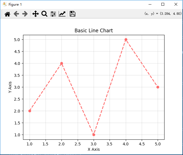
2. 柱状图
import matplotlib.pyplot as plt
categories = ['A', 'B', 'C', 'D']
values = [23, 45, 56, 78]

plt.bar(categories, values,
        color=['#4ecdc4', '#45b7d1', '#3d99be', '#357bac'],
        edgecolor='black')
plt.ylim(0, 100)
plt.show()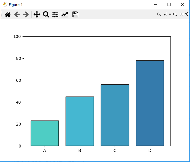
四、进阶可视化技巧
1. 样式美化
plt.style.use('ggplot')  # 使用内置主题
plt.rcParams['font.family'] = 'SimHei'  # 解决中文显示问题
plt.rcParams['axes.unicode_minus'] = False  # 显示负号
2. 多子图布局
fig, axes = plt.subplots(2, 2, figsize=(10, 8))
axes[0,0].plot(x, y)  # 第一行第一列
axes[1,1].scatter(x, y)  # 第二行第二列
plt.tight_layout()
五、实战:数据可视化
import matplotlib.pyplot as plt
import numpy as np

# 设置全局样式
plt.style.use('seaborn-v0_8')          # 默认 seaborn 样式
plt.rcParams['font.family'] = 'Microsoft YaHei'  # 设置中文字体
plt.rcParams['axes.unicode_minus'] = False  # 解决负号显示问题

# 创建测试数据
x = np.linspace(0, 10, 100)
y1 = np.sin(x)
y2 = np.cos(x)
categories = ['A', 'B', 'C', 'D', 'E']
values = np.random.randint(20, 100, 5)
sizes = np.random.rand(5)
colors = ['#FF6B6B', '#4ECDC4', '#45B7D1', '#A3D977', '#FFD93D']

# 创建画布和子图布局
fig = plt.figure(figsize=(16, 10), dpi=100)
gs = fig.add_gridspec(2, 3)

# 1. 折线图
ax1 = fig.add_subplot(gs[0, :2])
ax1.plot(x, y1, label='sin(x)', color='#FF6B6B', linewidth=2, marker='o', markersize=5)
ax1.plot(x, y2, label='cos(x)', color='#4ECDC4', linestyle='--')
ax1.set_title("三角函数曲线", fontsize=14)
ax1.set_xlabel("X轴")
ax1.set_ylabel("Y轴")
ax1.legend()
ax1.grid(True, alpha=0.3)

# 2. 柱状图
ax2 = fig.add_subplot(gs[0, 2])
bars = ax2.bar(categories, values,
              color=colors,
              edgecolor='black',
              linewidth=1)
ax2.set_title("分类数据柱状图", fontsize=14)
ax2.set_ylabel("数值")
# 添加数值标签
for bar in bars:
    height = bar.get_height()
    ax2.text(bar.get_x() + bar.get_width()/2., height,
             f'{height}',
             ha='center', va='bottom')

# 3. 散点图
ax3 = fig.add_subplot(gs[1, 0])
sc = ax3.scatter(x[::5], y1[::5],
                c=np.random.rand(20),
                s=100*np.random.rand(20),
                cmap='viridis',
                alpha=0.7)
ax3.set_title("散点图示例", fontsize=14)
ax3.set_xlabel("X值")
ax3.set_ylabel("Y值")
plt.colorbar(sc, ax=ax3)

# 4. 饼图
ax4 = fig.add_subplot(gs[1, 1])
wedges, texts, autotexts = ax4.pie(values,
                                  labels=categories,
                                  colors=colors,
                                  autopct='%1.1f%%',
                                  startangle=90,
                                  explode=(0, 0.1, 0, 0, 0))
ax4.set_title("比例分布饼图", fontsize=14)
# 设置百分比文字样式
plt.setp(autotexts, size=10, weight="bold", color='white')

# 5. 箱线图
ax5 = fig.add_subplot(gs[1, 2])
data = [np.random.normal(0, std, 100) for std in range(1, 4)]
ax5.boxplot(data,
           patch_artist=True,
           boxprops=dict(facecolor='#4ECDC4', color='black'),
           flierprops=dict(marker='o', markersize=5))
ax5.set_title("数据分布箱线图", fontsize=14)
ax5.set_xticklabels(['Group 1', 'Group 2', 'Group 3'])

# 整体设置
plt.suptitle("Matplotlib 综合示例", fontsize=18, y=1.02)
plt.tight_layout()

# 保存图片
plt.savefig('matplotlib_demo.png',
           bbox_inches='tight',
           dpi=300,
           facecolor='white')

# 显示图表
plt.show()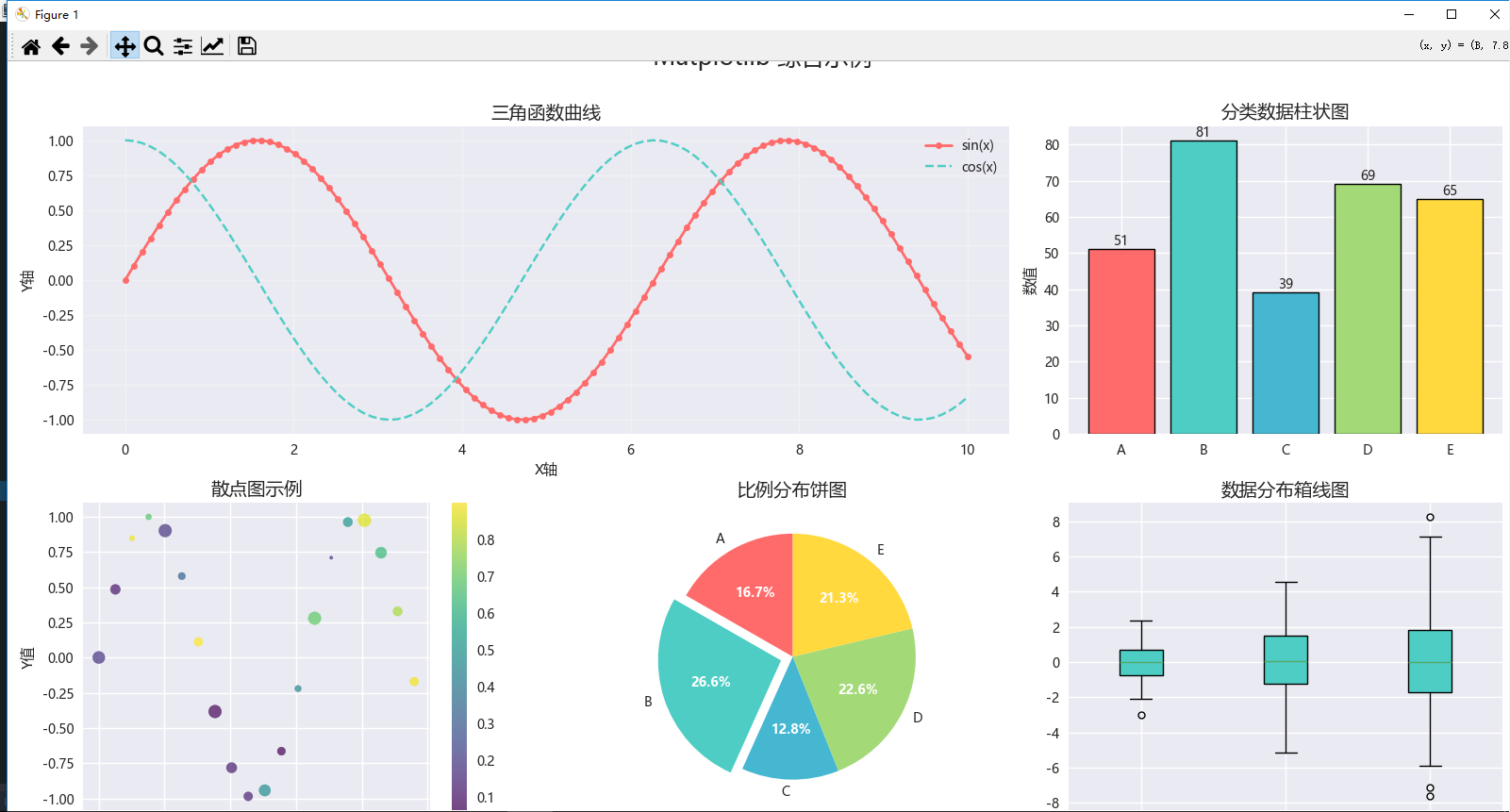

魔乐社区(Modelers.cn) 是一个中立、公益的人工智能社区,提供人工智能工具、模型、数据的托管、展示与应用协同服务,为人工智能开发及爱好者搭建开放的学习交流平台。社区通过理事会方式运作,由全产业链共同建设、共同运营、共同享有,推动国产AI生态繁荣发展。
更多推荐

 0
0 0
0- 0


 已为社区贡献5条内容

所有评论(0)