Python 数据可视化 下载数据
要求:从网上下载数据,并对这些数据进行可视化。以两种常见格式存储的数据:CSV、JSONCSV格式数据的处理:要在文本文件中存储数据,最简单的方式是将数据作为一系列以逗号分隔的值(CSV)写入文件。Example 1:处理锡特卡的天气数据import csvfrom matplotlib import pyplot as pltfrom datetime import date...
·
要求:
从网上下载数据,并对这些数据进行可视化。
以两种常见格式存储的数据:
CSV、JSON
CSV格式数据的处理:
要在文本文件中存储数据,最简单的方式是将数据作为一系列以逗号分隔的值(CSV)写入文件。
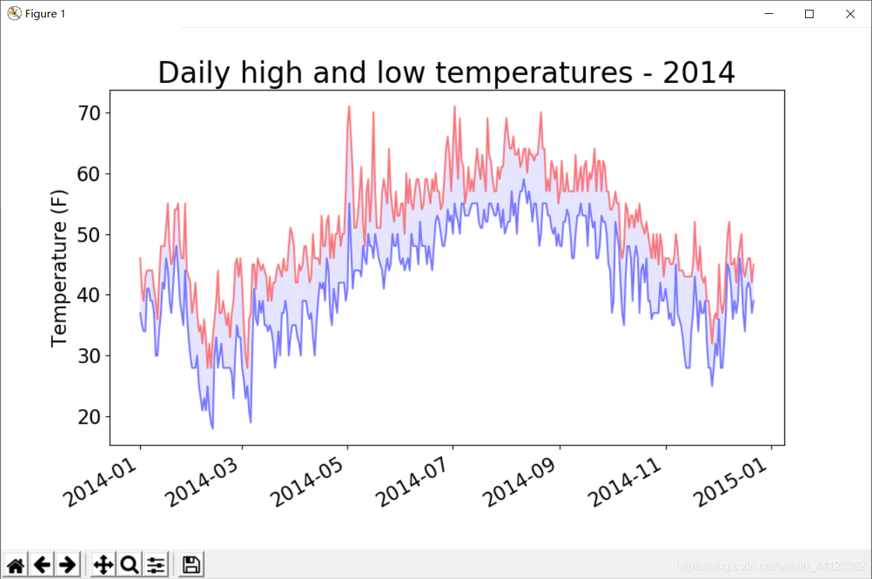
Example 1:处理锡特卡的天气数据
import csv

from matplotlib import pyplot as plt
from datetime import datetime

#从文件中获取日期、最高气温、最低气温
filename = 'sitka_weather_2014.csv'
with open(filename) as f:
    reader = csv.reader(f) #创建一个阅读器对象
    header_row = next(reader) #next()返回文件中的下一行

    """
    #我们对列表调用了enumerate()来获取每个元素的索引及其值
    for index, colom_header in enumerate(header_row):
        print(index, colom_header)
    """

    dates, highs, lows =[], [], []
    for row in reader:
        #创建一个日期对象
        current_date = datetime.strptime(row[0], "%Y-%m-%d")
        dates.append(current_date)

        high = int(row[1])
        highs.append(high)

        low = int(row[3])
        lows.append(low)

    print(highs)

#根据数据绘制图形
fig = plt.figure(figsize=(10,6))
plt.plot(dates, highs, c='red', alpha=0.5)
plt.plot(dates, lows, c='blue', alpha=0.5)
"""
给图表区域着色,接受一个x和两个y,填充两个y之间的区域
alpha指定颜色透明度,0表示完全透明,1(默认)表示完全不透明
"""
plt.fill_between(dates, highs, lows, facecolor='blue', alpha=0.1)

#设置图形的格式
plt.title("Daily high and low temperatures - 2014", fontsize=24)
plt.xlabel('', fontsize=16)
fig.autofmt_xdate() #绘制斜的日期,避免重叠
plt.ylabel("Temperature (F)", fontsize=16)
plt.tick_params(axis='both', which='major', labelsize=16)

plt.show()
Example 2:绘制图像时错误检查
处理死亡谷的天气数据。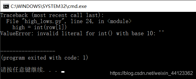
发现运行时出现了一个错误。Python无法处理某一天的最高气温,因为它无法将空字符串(’ ')转换为整数。
    for row in reader:
        #处理异常
        try:
            current_date = datetime.strptime(row[0], "%Y-%m-%d")
            high = int(row[1])
            low = int(row[3])
        except ValueError:
            print(current_date, 'missing data')
        else:
            dates.append(current_date)
            highs.append(high)
            lows.append(low)

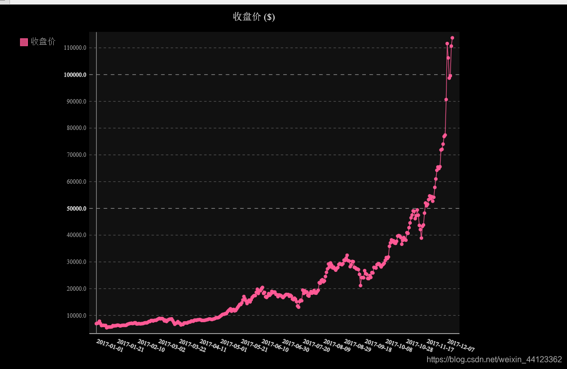
Example 3:制作交易收盘价走势图:JSON格式
import json
import pygal

#将数据加载到一个列表中
filename = 'btc_close_2017.json'
with open(filename) as f:
    btc_data = json.load(f)
#打印每一天的信息
for btc_dict in btc_data:
    date = btc_dict['date']
    month = int(btc_dict['month'])
    week = int(btc_dict['week'])
    weekday = btc_dict['weekday']
    close = int(float((btc_dict['close'])))
    #格式化输出数据
    print("{} is month {} week {}, {}, the close price is {}RMB)".format(
         date, month, week, weekday, close))

#创建5个列表,分别存储日期和收盘价
dates = []
months = []
weeks = []
weekdays = []
close = []
#每一天的信息
for btc_dict in btc_data:
    dates.append(btc_dict['date'])
    months.append(int(btc_dict['month']))
    weeks.append(int(btc_dict['week']))
    weekdays.append(btc_dict['weekday'])
    close.append(int(float(btc_dict['close'])))

"""
x_label_rotation=20让x轴上的日期标签顺时针旋转20度
show_minor_x_labels告诉图形不用显示所有的x轴标签
"""
line_chart = pygal.Line(x_label_rotation=20, show_minor_x_labels=False)
line_chart.title = '收盘价 ($)'
line_chart.x_labels = dates
N = 20 #x轴坐标每隔20天显示一次
line_chart.x_labels_major = dates[::N]
line_chart.add('收盘价', close)
line_chart.render_to_file('收盘价折线图($).svg')
时间序列特征初探:
进行时间序列分析总是期望发现趋势,周期性和噪声,从而能够描述事实,预测未来,做出决策。
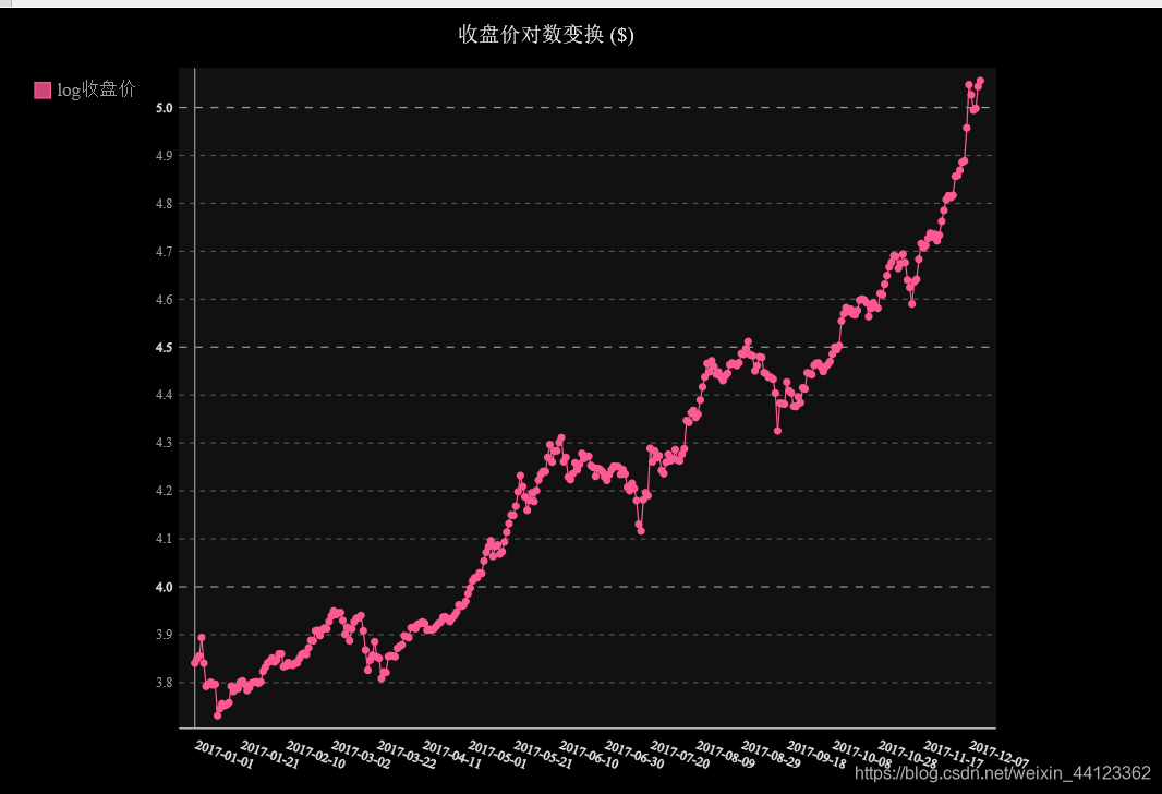
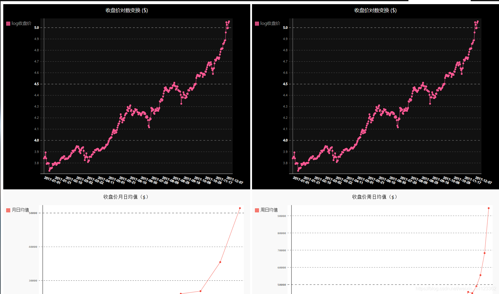
对数变换:
line_chart = pygal.Line(x_label_rotation=20, show_minor_x_labels=False)
line_chart.title = '收盘价对数变换 ($)'
line_chart.x_labels = dates
N = 20 #x轴坐标每隔20天显示一次
line_chart.x_labels_major = dates[::N]
close_log = [math.log10(_) for _ in close]
line_chart.add('log收盘价', close_log)
line_chart.render_to_file('收盘价对数变换折线图($).svg')
收盘价均值+数据仪表盘
import json
import pygal
import math
from itertools import groupby
#将数据加载到一个列表中
filename = 'btc_close_2017.json'
with open(filename) as f:
btc_data = json.load(f)
#创建5个列表,分别存储日期和收盘价
dates = []
months = []
weeks = []
weekdays = []
close = []
#每一天的信息
for btc_dict in btc_data:
dates.append(btc_dict['date'])
months.append(int(btc_dict['month']))
weeks.append(int(btc_dict['week']))
weekdays.append(btc_dict['weekday'])
close.append(int(float(btc_dict['close'])))
def draw_line(x_data, y_data, title, y_legend):
xy_map = []
for x, y in groupby(sorted(zip(x_data, y_data)), key=lambda _: _[0]):
y_list = [v for _, v in y]
xy_map.append([x, sum(y_list) / len(y_list)])
x_unique, y_mean = [*zip(*xy_map)]
line_chart = pygal.Line()
line_chart.title = title
line_chart.x_labels = x_unique
line_chart.add(y_legend, y_mean)
line_chart.render_to_file(title + '.svg')
return line_chart
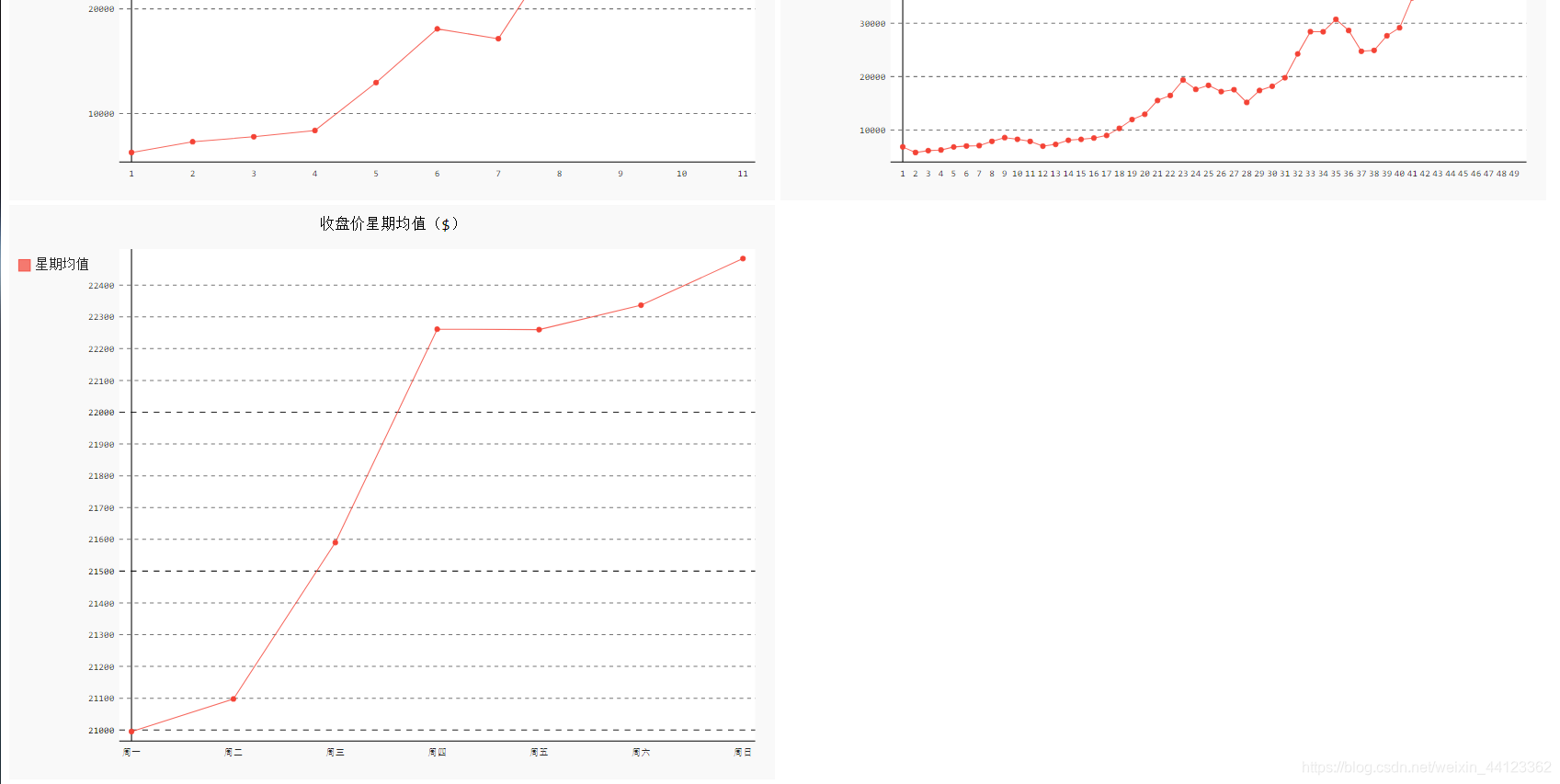
idx_month = dates.index('2017-12-01')
line_chart_month = draw_line(
months[:idx_month], close[:idx_month], '收盘价月日均值($)', '月日均值')
idx_week = dates.index('2017-12-11')
line_chart_week = draw_line(
weeks[1:idx_week], close[1:idx_week], '收盘价周日均值($)', '周日均值')
idx_week = dates.index('2017-12-11')
wd = ['Monday', 'Tuesday', 'Wednesday',
'Thursday', 'Friday', 'Saturday', 'Sunday']
weekdays_int = [wd.index(w) + 1 for w in weekdays[1:idx_week]]
line_chart_weekday = draw_line(
weekdays_int, close[1:idx_week], '收盘价星期均值($)', '星期均值')
line_chart_weekday.x_labels = ['周一', '周二', '周三', '周四', '周五', '周六', '周日']
line_chart_weekday.render_to_file('收盘价星期均值($).svg')
#数据仪表盘
with open('收盘价Dashboard.html', 'w', encoding='utf8') as html_file:
html_file.write(
'<html><head><title>收盘价Dashboard</title><meta charset="utf-8"></head><body>\n')
for svg in [
'收盘价折线图($).svg', '收盘价对数变换折线图($).svg', '收盘价月日均值($).svg',
'收盘价周日均值($).svg', '收盘价星期均值($).svg'
]:
html_file.write(
' <object type="image/svg+xml" data="{0}" height=500></object>\n'.format(svg))
html_file.write('</body></html>')

魔乐社区(Modelers.cn) 是一个中立、公益的人工智能社区,提供人工智能工具、模型、数据的托管、展示与应用协同服务,为人工智能开发及爱好者搭建开放的学习交流平台。社区通过理事会方式运作,由全产业链共同建设、共同运营、共同享有,推动国产AI生态繁荣发展。
更多推荐


 1
1 0
0- 0


 已为社区贡献2条内容

所有评论(0)