微信小程序自学(六)-- 组件-视图容器
一 view
视图容器。
| 属性名 | 类型 | 默认值 | 说明 | 最低版本 |
|---|---|---|---|---|
| hover-class | String | none | 指定按下去的样式类。当 hover-class="none" 时,没有点击态效果 |
|
| hover-stop-propagation | Boolean | false | 指定是否阻止本节点的祖先节点出现点击态 | 1.5.0 |
| hover-start-time | Number | 50 | 按住后多久出现点击态,单位毫秒 | |
| hover-stay-time | Number | 400 | 手指松开后点击态保留时间,单位毫秒 | |
| aria-role | String | 无障碍访问,(角色)标识元素的作用 | 2.5.0 | |
| aria-label | String | 无障碍访问,(属性)元素的额外描述 | 2.5.0 |
示例:
<view class="section">
  <view class="section__title">flex-direction: row</view>
  <view class="flex-wrp" style="flex-direction:row;">
    <view class="flex-item bc_green">1</view>
    <view class="flex-item bc_red">2</view>
    <view class="flex-item bc_blue">3</view>
  </view>
</view>
<view class="section">
  <view class="section__title">flex-direction: column</view>
  <view class="flex-wrp" style="height: 300px;flex-direction:column;">
    <view class="flex-item bc_green">1</view>
    <view class="flex-item bc_red">2</view>
    <view class="flex-item bc_blue">3</view>
  </view>
</view>

Bug & Tip
tip: 如果需要使用滚动视图,请使用 scroll-view
这个view视图和普通的view用法相识, 在这就不多多阐述了,
二 scroll-view
可滚动视图区域。
| 属性名 | 类型 | 默认值 | 说明 |
|---|---|---|---|
| scroll-x | Boolean | false | 允许横向滚动 |
| scroll-y | Boolean | false | 允许纵向滚动 |
| upper-threshold | Number / String | 50 | 距顶部/左边多远时(单位px,2.4.0起支持rpx),触发 scrolltoupper 事件 |
| lower-threshold | Number / String | 50 | 距底部/右边多远时(单位px,2.4.0起支持rpx),触发 scrolltolower 事件 |
| scroll-top | Number / String | 设置竖向滚动条位置(单位px,2.4.0起支持rpx) | |
| scroll-left | Number / String | 设置横向滚动条位置(单位px,2.4.0起支持rpx) | |
| scroll-into-view | String | 值应为某子元素id(id不能以数字开头)。设置哪个方向可滚动,则在哪个方向滚动到该元素 | |
| scroll-with-animation | Boolean | false | 在设置滚动条位置时使用动画过渡 |
| enable-back-to-top | Boolean | false | iOS点击顶部状态栏、安卓双击标题栏时,滚动条返回顶部,只支持竖向 |
| bindscrolltoupper | EventHandle | 滚动到顶部/左边,会触发 scrolltoupper 事件 | |
| bindscrolltolower | EventHandle | 滚动到底部/右边,会触发 scrolltolower 事件 | |
| bindscroll | EventHandle | 滚动时触发,event.detail = {scrollLeft, scrollTop, scrollHeight, scrollWidth, deltaX, deltaY} | |
| aria-label | String | 无障碍访问,(属性)元素的额外描述 2.5.0 |
使用竖向滚动时,需要给<scroll-view>一个固定高度,通过 WXSS 设置 height。
示例代码:
<view class="section">
  <view class="section__title">vertical scroll</view>
  <scroll-view
    scroll-y
    style="height: 200px;"
    bindscrolltoupper="upper"
    bindscrolltolower="lower"
    bindscroll="scroll"
    scroll-into-view="{{toView}}"
    scroll-top="{{scrollTop}}"
  >
    <view id="green" class="scroll-view-item bc_green"></view>
    <view id="red" class="scroll-view-item bc_red"></view>
    <view id="yellow" class="scroll-view-item bc_yellow"></view>
    <view id="blue" class="scroll-view-item bc_blue"></view>
  </scroll-view>

  <view class="btn-area">
    <button size="mini" bindtap="tap">click me to scroll into view</button>
    <button size="mini" bindtap="tapMove">click me to scroll</button>
  </view>
</view>
<view class="section section_gap">
  <view class="section__title">horizontal scroll</view>
  <scroll-view class="scroll-view_H" scroll-x style="width: 100%">
    <view id="green" class="scroll-view-item_H bc_green"></view>
    <view id="red" class="scroll-view-item_H bc_red"></view>
    <view id="yellow" class="scroll-view-item_H bc_yellow"></view>
    <view id="blue" class="scroll-view-item_H bc_blue"></view>
  </scroll-view>
</view>
const order = ['red', 'yellow', 'blue', 'green', 'red']
Page({
  data: {
    toView: 'red',
    scrollTop: 100
  },
  upper(e) {
    console.log(e)
  },
  lower(e) {
    console.log(e)
  },
  scroll(e) {
    console.log(e)
  },
  tap(e) {
    for (let i = 0; i < order.length; ++i) {
      if (order[i] === this.data.toView) {
        this.setData({
          toView: order[i + 1]
        })
        break
      }
    }
  },
  tapMove(e) {
    this.setData({
      scrollTop: this.data.scrollTop + 10
    })
  }
})

Bug & Tip
tip: 请勿在scroll-view中使用textarea、map、canvas、video组件tip:scroll-into-view的优先级高于scroll-toptip: 在滚动scroll-view时会阻止页面回弹,所以在scroll-view中滚动,是无法触发onPullDownRefreshtip: 若要使用下拉刷新,请使用页面的滚动,而不是scroll-view,这样也能通过点击顶部状态栏回到页面顶部
我们先实现竖向滑动效果
首先我们定义一个scroll-view标签, 并且开启竖向滑动
<scroll-view class = "scroll" scroll-y = "true" > </scroll-view>然后我们让一个红色框框和一个绿色框放在scroll-view标签里面
<scroll-view  class = "scroll"  scroll-y = "true"  >
    <view class = "image1"></view>
     <view class = "image2"></view>
</scroll-view>
接下来我们设置样式
.scroll{
    height: 150px
}

.image1{
    height: 100px;
    background: red
}

.image2{
    height: 100px;
    background: green
}
我们运行一下:
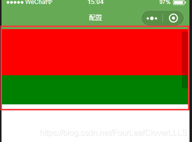
可以用鼠标左右滑动了
这里做几点说明:
1. 当设置竖向滑动时一定要设置scroll-view标签的高度, 并且在scroll-view里面标签的总高度要超过scroll-view标签的高度, 试着想一下, 如果里面的总高度比scroll-view标签的高度还低, 那怎么能达到滑动效果?
2. 要滑动的元素一定是在scroll-view标签里面, 一开始我傻了, 放在外面, 怎么也达不到效果。
3. 标签里面的各个标签一定要有区别, 不然很难发现是否滑动了, 比如里面的标签都是白色, 那怎么能看出效果
scroll-view标签我们讲到这, 至于其他功能, 去尝试一下, 我在这就不做演示了。
三 swiper
滑块视图容器。
| 属性名 | 类型 | 默认值 | 说明 | 最低版本 |
|---|---|---|---|---|
| indicator-dots | Boolean | false | 是否显示面板指示点 | |
| indicator-color | Color | rgba(0, 0, 0, .3) | 指示点颜色 | 1.1.0 |
| indicator-active-color | Color | #000000 | 当前选中的指示点颜色 | 1.1.0 |
| autoplay | Boolean | false | 是否自动切换 | |
| current | Number | 0 | 当前所在滑块的 index | |
| current-item-id | String | "" | 当前所在滑块的 item-id ,不能与 current 被同时指定 | 1.9.0 |
| interval | Number | 5000 | 自动切换时间间隔 | |
| duration | Number | 500 | 滑动动画时长 | |
| circular | Boolean | false | 是否采用衔接滑动 | |
| vertical | Boolean | false | 滑动方向是否为纵向 | |
| previous-margin | String | "0px" | 前边距,可用于露出前一项的一小部分,接受 px 和 rpx 值 | 1.9.0 |
| next-margin | String | "0px" | 后边距,可用于露出后一项的一小部分,接受 px 和 rpx 值 | 1.9.0 |
| display-multiple-items | Number | 1 | 同时显示的滑块数量 | 1.9.0 |
| skip-hidden-item-layout | Boolean | false | 是否跳过未显示的滑块布局,设为 true 可优化复杂情况下的滑动性能,但会丢失隐藏状态滑块的布局信息 | 1.9.0 |
| bindchange | EventHandle | current 改变时会触发 change 事件,event.detail = {current: current, source: source} | ||
| bindtransition | EventHandle | swiper-item 的位置发生改变时会触发 transition 事件,event.detail = {dx: dx, dy: dy} | 2.4.3 | |
| bindanimationfinish | EventHandle | 动画结束时会触发 animationfinish 事件,event.detail 同上 | 1.9.0 |
从 1.4.0 开始,change事件返回detail中包含一个source字段,表示导致变更的原因,可能值如下:
autoplay自动播放导致swiper变化;touch用户划动引起swiper变化;- 其他原因将用空字符串表示。
注意:其中只可放置<swiper-item/>组件,否则会导致未定义的行为。
swiper-item
仅可放置在<swiper>组件中,宽高自动设置为100%。
| 属性名 | 类型 | 默认值 | 说明 | 最低版本 |
|---|---|---|---|---|
| item-id | String | "" | 该 swiper-item 的标识符 | 1.9.0 |
示例代码:
<swiper
  indicator-dots="{{indicatorDots}}"
  autoplay="{{autoplay}}"
  interval="{{interval}}"
  duration="{{duration}}"
>
  <block wx:for="{{imgUrls}}">
    <swiper-item>
      <image src="{{item}}" class="slide-image" width="355" height="150" />
    </swiper-item>
  </block>
</swiper>
<button bindtap="changeIndicatorDots">indicator-dots</button>
<button bindtap="changeAutoplay">autoplay</button>
<slider bindchange="intervalChange" show-value min="500" max="2000" />
interval
<slider bindchange="durationChange" show-value min="1000" max="10000" />
duration
Page({
  data: {
    imgUrls: [
      'http://img02.tooopen.com/images/20150928/tooopen_sy_143912755726.jpg',
      'http://img06.tooopen.com/images/20160818/tooopen_sy_175866434296.jpg',
      'http://img06.tooopen.com/images/20160818/tooopen_sy_175833047715.jpg'
    ],
    indicatorDots: false,
    autoplay: false,
    interval: 5000,
    duration: 1000
  },
  changeIndicatorDots(e) {
    this.setData({
      indicatorDots: !this.data.indicatorDots
    })
  },
  changeAutoplay(e) {
    this.setData({
      autoplay: !this.data.autoplay
    })
  },
  intervalChange(e) {
    this.setData({
      interval: e.detail.value
    })
  },
  durationChange(e) {
    this.setData({
      duration: e.detail.value
    })
  }
})
Bug & Tip
tip: 如果在bindchange的事件回调函数中使用setData改变current值,则有可能导致setData被不停地调用,因而通常情况下请在改变current值前检测source字段来判断是否是由于用户触摸引起。
这一节由我设置的一个轮播图, 代码如下:
index.wxml
<swiper indicator-dots="true" indicator-active-color="red" autoplay="{{autoplay}}" interval="{{interval}}" duration="{{duration}}">
      <block wx:for="{{imgUrls}}" >
        <swiper-item>
            <image src="{{item}}"></image>
        </swiper-item>
     </block>
</swiper>
<switch bindchange="bindchange">自动播放</switch>
<slider max="10000"  class="slider1" color="#FFE1FF" selected-color="#FF1493" block-color="	#FFD700" show-value="true" bindchanging="bindchanging1">切换速度</slider>
<slider max="50000" class="slider2" color="#FFE1FF" selected-color="#FF1493"  block-color="	#FFD700" show-value="true" bindchanging="bindchanging2">图片滚动时间</slider>
index.js
Page({
    data: {
        imgUrls: [
            'http://img02.tooopen.com/images/20150928/tooopen_sy_143912755726.jpg',
            'http://img06.tooopen.com/images/20160818/tooopen_sy_175866434296.jpg',
            'http://img06.tooopen.com/images/20160818/tooopen_sy_175833047715.jpg'
        ],
        autoplay: false,
        interval:1000,
        duration: 500
    },
    // 按键触发时间
    bindchange:function(){
        // 按键状态更改时改变轮播图的状态
        this.setData({
            //设置是否开启自动播放
            autoplay:  !this.data.autoplay
        })
    },
    //切换速度滑块触发事件
    bindchanging1:function(e){
        this.setData({
            //设置切换速度时间
            interval: e.detail.value
        })
    },
    //图片滚动时间触发事件
    bindchanging2: function (e) {
        this.setData({
            //设置图片滚动时间
            duration: e.detail.value
        })
    }
})
效果:
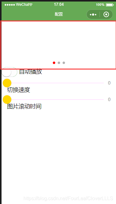
注意: 在本地调试的时候加载图片的时候报了403错误, 而在真机调试的时候图片加载正常, 我是用手机调试的。
四 movable-view
基础库 1.2.0 开始支持,低版本需做兼容处理。
可移动的视图容器,在页面中可以拖拽滑动
| 属性名 | 类型 | 默认值 | 说明 | 最低版本 |
|---|---|---|---|---|
| direction | String | none | movable-view的移动方向,属性值有all、vertical、horizontal、none | |
| inertia | Boolean | false | movable-view是否带有惯性 | |
| out-of-bounds | Boolean | false | 超过可移动区域后,movable-view是否还可以移动 | |
| x | Number / String | 定义x轴方向的偏移,如果x的值不在可移动范围内,会自动移动到可移动范围;改变x的值会触发动画 | ||
| y | Number / String | 定义y轴方向的偏移,如果y的值不在可移动范围内,会自动移动到可移动范围;改变y的值会触发动画 | ||
| damping | Number | 20 | 阻尼系数,用于控制x或y改变时的动画和过界回弹的动画,值越大移动越快 | |
| friction | Number | 2 | 摩擦系数,用于控制惯性滑动的动画,值越大摩擦力越大,滑动越快停止;必须大于0,否则会被设置成默认值 | |
| disabled | Boolean | false | 是否禁用 | 1.9.90 |
| scale | Boolean | false | 是否支持双指缩放,默认缩放手势生效区域是在movable-view内 | 1.9.90 |
| scale-min | Number | 0.5 | 定义缩放倍数最小值 | 1.9.90 |
| scale-max | Number | 10 | 定义缩放倍数最大值 | 1.9.90 |
| scale-value | Number | 1 | 定义缩放倍数,取值范围为 0.5 - 10 | 1.9.90 |
| animation | Boolean | true | 是否使用动画 | 2.1.0 |
| bindchange | EventHandle | 拖动过程中触发的事件,event.detail = {x: x, y: y, source: source},其中source表示产生移动的原因,值可为touch(拖动)、touch-out-of-bounds(超出移动范围)、out-of-bounds(超出移动范围后的回弹)、friction(惯性)和空字符串(setData) | 1.9.90 | |
| bindscale | EventHandle | 缩放过程中触发的事件,event.detail = {x: x, y: y, scale: scale},其中x和y字段在2.1.0之后开始支持返回 | 1.9.90 |
除了基本事件外,movable-view提供了两个特殊事件
| 类型 | 触发条件 | 最低版本 |
|---|---|---|
| htouchmove | 初次手指触摸后移动为横向的移动,如果catch此事件,则意味着touchmove事件也被catch | 1.9.90 |
| vtouchmove | 初次手指触摸后移动为纵向的移动,如果catch此事件,则意味着touchmove事件也被catch | 1.9.90 |
movable-view 必须设置width和height属性,不设置默认为10px
movable-view 默认为绝对定位,top和left属性为0px
注意:movable-view必须在<movable-area/>组件中,并且必须是直接子节点,否则不能移动。
movable-area
基础库 1.2.0 开始支持,低版本需做兼容处理。
movable-view 的可移动区域
| 属性名 | 类型 | 默认值 | 说明 | 最低版本 |
|---|---|---|---|---|
| scale-area | Boolean | false | 当里面的movable-view设置为支持双指缩放时,设置此值可将缩放手势生效区域修改为整个movable-area | 1.9.90 |
注意:movable-area 必须设置width和height属性,不设置默认为10px
当movable-view小于movable-area时,movable-view的移动范围是在movable-area内;
当movable-view大于movable-area时,movable-view的移动范围必须包含movable-area(x轴方向和y轴方向分开考虑)
示例代码:
<view class="section">
  <view class="section__title">movable-view区域小于movable-area</view>
  <movable-area style="height: 200px; width: 200px; background: red;">
    <movable-view
      style="height: 50px; width: 50px; background: blue;"
      x="{{x}}"
      y="{{y}}"
      direction="all"
    ></movable-view>
  </movable-area>
  <view class="btn-area">
    <button size="mini" bindtap="tap">click me to move to (30px, 30px)</button>
  </view>
  <view class="section__title">movable-view区域大于movable-area</view>
  <movable-area style="height: 100px; width: 100px; background: red;">
    <movable-view
      style="height: 200px; width: 200px; background: blue;"
      direction="all"
    ></movable-view>
  </movable-area>
  <view class="section__title">可放缩</view>
  <movable-area
    style="height: 200px; width: 200px; background: red;"
    scale-area
  >
    <movable-view
      style="height: 50px; width: 50px; background: blue;"
      direction="all"
      bindchange="onChange"
      bindscale="onScale"
      scale
      scale-min="0.5"
      scale-max="4"
      scale-value="2"
    ></movable-view>
  </movable-area>
</view>
Page({
  data: {
    x: 0,
    y: 0
  },
  tap(e) {
    this.setData({
      x: 30,
      y: 30
    })
  },
  onChange(e) {
    console.log(e.detail)
  },
  onScale(e) {
    console.log(e.detail)
  }
})
这一部分内容自己试验吧, 不做很多的讲解。
五 cover-view
基础库 1.4.0 开始支持,低版本需做兼容处理。
覆盖在原生组件之上的文本视图,可覆盖的原生组件包括map、video、canvas、camera、live-player、live-pusher,只支持嵌套cover-view、cover-image,可在cover-view中使用button。
| 属性名 | 类型 | 默认值 | 说明 | 最低版本 |
|---|---|---|---|---|
| scroll-top | Number / String | 设置顶部滚动偏移量,仅在设置了 overflow-y: scroll 成为滚动元素后生效(单位px,2.4.0起支持rpx) | 2.1.0 | |
| aria-role | String | 无障碍访问,(角色)标识元素的作用 | 2.5.0 | |
| aria-label | String | 无障碍访问,(属性)元素的额外描述 | 2.5.0 |
六 cover-image
基础库 1.4.0 开始支持,低版本需做兼容处理。
覆盖在原生组件之上的图片视图,可覆盖的原生组件同cover-view,支持嵌套在cover-view里。
| 属性名 | 类型 | 默认值 | 说明 | 最低版本 |
|---|---|---|---|---|
| src | String | 图标路径,支持临时路径、网络地址(1.6.0起支持)、云文件ID(2.2.3起支持)。暂不支持base64格式。 | ||
| bindload | EventHandle | 图片加载成功时触发 | 2.1.0 | |
| binderror | EventHandle | 图片加载失败时触发 | 2.1.0 | |
| aria-role | String | 无障碍访问,(角色)标识元素的作用 | 2.5.0 | |
| aria-label | String | 无障碍访问,(属性)元素的额外描述 | 2.5.0 |
Bug & Tips
tip:<cover-view>和<cover-image>的aria-role仅可设置为button,读屏模式下才可以点击,并朗读出“按钮”;为空时可以聚焦,但不可点击tip: 基础库 2.2.4 起支持 touch 相关事件,也可使用 hover-class 设置点击态tip: 基础库 2.1.0 起支持设置scalerotate的 css 样式,包括 transition 动画tip: 基础库 1.9.90 起cover-view支持overflow: scroll,但不支持动态更新overflowtip: 基础库 1.9.90 起最外层cover-view支持position: fixedtip: 基础库 1.9.0 起支持插在view等标签下。在此之前只可嵌套在原生组件map、video、canvas、camera内,避免嵌套在其他组件内。tip: 基础库 1.6.0 起支持css transition动画,transition-property只支持transform (translateX, translateY)与opacity。tip: 基础库 1.6.0 起支持css opacity。tip: 事件模型遵循冒泡模型,但不会冒泡到原生组件。tip: 文本建议都套上cover-view标签,避免排版错误。tip: 只支持基本的定位、布局、文本样式。不支持设置单边的border、background-image、shadow、overflow: visible等。tip: 建议子节点不要溢出父节点tip: 默认设置的样式有:white-space: nowrap;line-height: 1.2;display: block;bug: 自定义组件嵌套cover-view时,自定义组件的 slot 及其父节点暂不支持通过 wx:if 控制显隐,否则会导致cover-view不显示
示例:
<video
  id="myVideo"
  src="http://wxsnsdy.tc.qq.com/105/20210/snsdyvideodownload?filekey=30280201010421301f0201690402534804102ca905ce620b1241b726bc41dcff44e00204012882540400&bizid=1023&hy=SH&fileparam=302c020101042530230204136ffd93020457e3c4ff02024ef202031e8d7f02030f42400204045a320a0201000400"
  controls="{{false}}"
  event-model="bubble"
>
  <cover-view class="controls">
    <cover-view class="play" bindtap="play">
      <cover-image class="img" src="/path/to/icon_play" />
    </cover-view>
    <cover-view class="pause" bindtap="pause">
      <cover-image class="img" src="/path/to/icon_pause" />
    </cover-view>
    <cover-view class="time">00:00</cover-view>
  </cover-view>
</video>
.controls {
  position: relative;
  top: 50%;
  height: 50px;
  margin-top: -25px;
  display: flex;
}
.play,
.pause,
.time {
  flex: 1;
  height: 100%;
}
.time {
  text-align: center;
  background-color: rgba(0, 0, 0, 0.5);
  color: white;
  line-height: 50px;
}
.img {
  width: 40px;
  height: 40px;
  margin: 5px auto;
}
Page({
  onReady() {
    this.videoCtx = wx.createVideoContext('myVideo')
  },
  play() {
    this.videoCtx.play()
  },
  pause() {
    this.videoCtx.pause()
  }
})
魔乐社区(Modelers.cn) 是一个中立、公益的人工智能社区,提供人工智能工具、模型、数据的托管、展示与应用协同服务,为人工智能开发及爱好者搭建开放的学习交流平台。社区通过理事会方式运作,由全产业链共同建设、共同运营、共同享有,推动国产AI生态繁荣发展。
更多推荐

 0
0 0
0- 0


 已为社区贡献3条内容

所有评论(0)