Android减少开发过程中Drawable xml文件的数量
| 属性名称 | 示例 |
| — | — |
| XButtonCustom_corner | 圆角度数 |
| XButtonCustom_corner_type | 圆角类型,默认 all。left_top,left_bottom,right_top,right_bottom |
| XButtonCustom_solid_color | 背景填充颜色,当没有设置渐变填充时生效 |
| XButtonCustom_shadow_color | 外阴影色值 |
| XButtonCustom_shadow_radius | 外阴影半径 |
| XButtonCustom_shadow_dx | 外阴影x方向偏移 |
| XButtonCustom_shadow_dy | 外阴影y方向偏移 |
| XButtonCustom_solid_gradient | 渐变类型,linear, radial, sweep |
| XButtonCustom_gradient_start_color | 渐变起始颜色 |
| XButtonCustom_gradient_center_color | 渐变中间颜色 |
| XButtonCustom_gradient_end_color | 渐变结束颜色 |
| XButtonCustom_gradient_orientation | 渐变的方向 |
| XButtonCustom_gradient_radius | 渐变角度 |
| XButtonCustom_stroke_color | 描边颜色 |
| XButtonCustom_stroke_border | 描边宽度 |
| XButtonCustom_blur_type | 模糊类型,默认为normal。outer,solid,inner |
| XButtonCustom_blur_radius | 模糊半径 |
| XButtonCustom_blur_color | 模糊颜色 |
| XButtonCustom_state | selector类型,默认none。pressed, selected, checked。选定上述状态时,触发state前缀的属性 |
| XButtonCustom_stated_corner | state触发的圆角 |
| XButtonCustom_corner_type | state触发时的圆角类型,默认 all。left_top,left_bottom,right_top,right_bottom |
| XButtonCustom_stated_solid_color | state出发时背景填充颜色,当没有设置渐变填充时生效 |
| XButtonCustom_stated_shadow_color | 外阴影色值 |
| XButtonCustom_stated_shadow_radius | 外阴影半径 |
| XButtonCustom_stated_shadow_dx | 外阴影x方向偏移 |
| XButtonCustom_stated_shadow_dy | 外阴影y方向偏移 |
| XButtonCustom_stated_blur_type | 模糊类型,默认为normal。outer,solid,inner |
| XButtonCustom_stated_blur_radius | 模糊半径 |
| XButtonCustom_stated_blur_color | 模糊颜色 |
| XButtonCustom_stated_solid_gradient | 渐变类型,linear, radial, sweep |
| XButtonCustom_stated_gradient_start_color | 渐变起始颜色 |
| XButtonCustom_stated_gradient_center_color | 渐变中间颜色 |
| XButtonCustom_stated_gradient_end_color | 渐变结束颜色 |
| XButtonCustom_stated_gradient_orientation | 渐变的方向 |
| XButtonCustom_stated_gradient_radius | 渐变角度 |
| XButtonCustom_stated_stroke_color | 描边颜色 |
| XButtonCustom_stated_stroke_border | 描边宽度 |
| XButtonCustom_drawable | 正常情况下显示的drawable |
| XButtonCustom_stated_drawable | 在特定状态下显示的drawable, 如: selector |
上述的字段在代码中的修改方式,支持的修改的字段在
IDrawableEditTransition接口中定义
// 获取IDrawableEditTransition
XWidgetParser.getDrawableEditTransition(v)
?.beginNormalTransition
?.setCorner(10)
?.commit()
示例

集成
- 在project build.gradle 中加入
allprojects {
repositories {
maven { url ‘https://jitpack.io’ }
}
}
- 在要使用的module 的 build.gradle 中加入
implementation ‘com.github.shilec:XWidget:1.2.2’
- 添加混淆
-keep public class com.scott.xwidget.parser.**{*;}
扩展
自我介绍一下,小编13年上海交大毕业,曾经在小公司待过,也去过华为、OPPO等大厂,18年进入阿里一直到现在。
深知大多数初中级Android工程师,想要提升技能,往往是自己摸索成长或者是报班学习,但对于培训机构动则近万的学费,着实压力不小。自己不成体系的自学效果低效又漫长,而且极易碰到天花板技术停滞不前!
因此收集整理了一份《2024年Android移动开发全套学习资料》,初衷也很简单,就是希望能够帮助到想自学提升又不知道该从何学起的朋友,同时减轻大家的负担。
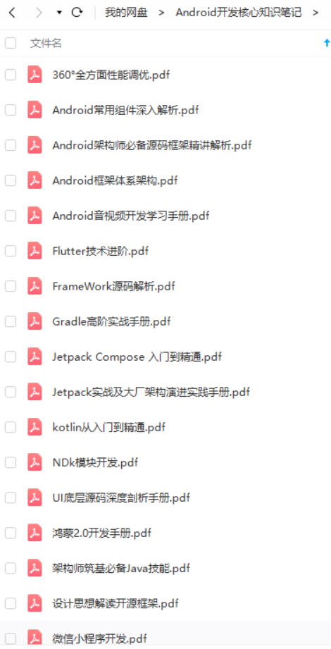
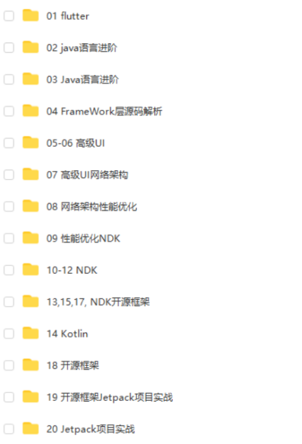
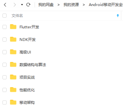
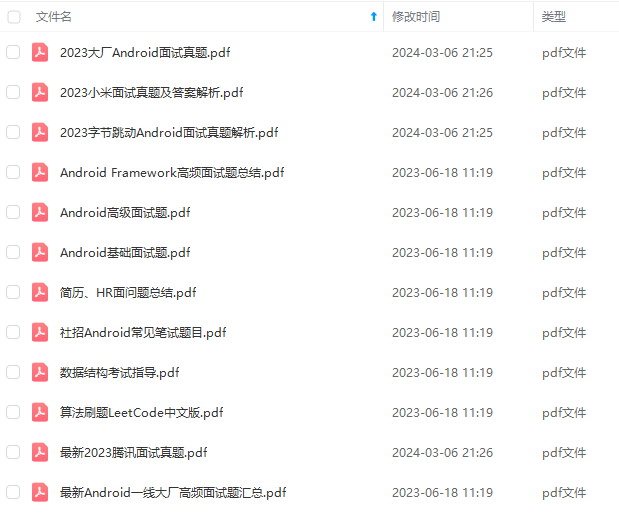
既有适合小白学习的零基础资料,也有适合3年以上经验的小伙伴深入学习提升的进阶课程,基本涵盖了95%以上Android开发知识点,真正体系化!
由于文件比较大,这里只是将部分目录截图出来,每个节点里面都包含大厂面经、学习笔记、源码讲义、实战项目、讲解视频,并且会持续更新!
如果你觉得这些内容对你有帮助,可以扫码获取!!(备注:Android)

总结
写到这里也结束了,在文章最后放上一个小小的福利,以下为小编自己在学习过程中整理出的一个关于Flutter的学习思路及方向,从事互联网开发,最主要的是要学好技术,而学习技术是一条慢长而艰苦的道路,不能靠一时激情,也不是熬几天几夜就能学好的,必须养成平时努力学习的习惯,更加需要准确的学习方向达到有效的学习效果。
由于内容较多就只放上一个大概的大纲,需要更及详细的学习思维导图的
还有高级UI、性能优化、架构师课程、NDK、混合式开发(ReactNative+Weex)微信小程序、Flutter全方面的Android进阶实践技术资料,并且还有技术大牛一起讨论交流解决问题。
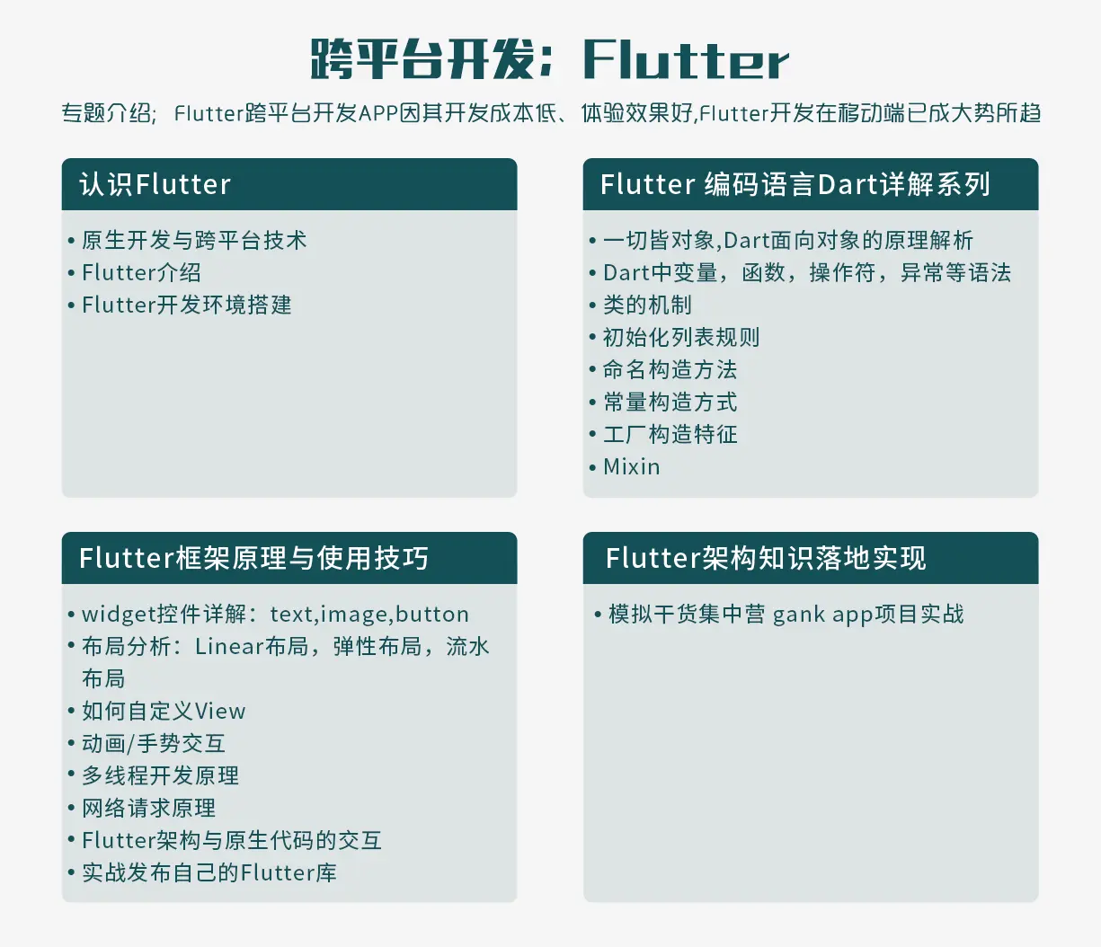
《互联网大厂面试真题解析、进阶开发核心学习笔记、全套讲解视频、实战项目源码讲义》点击传送门即可获取!
droid进阶实践技术资料,并且还有技术大牛一起讨论交流解决问题。**
[外链图片转存中…(img-nQqIMiBV-1713233208639)]
《互联网大厂面试真题解析、进阶开发核心学习笔记、全套讲解视频、实战项目源码讲义》点击传送门即可获取!

魔乐社区(Modelers.cn) 是一个中立、公益的人工智能社区,提供人工智能工具、模型、数据的托管、展示与应用协同服务,为人工智能开发及爱好者搭建开放的学习交流平台。社区通过理事会方式运作,由全产业链共同建设、共同运营、共同享有,推动国产AI生态繁荣发展。
更多推荐


 4
4 0
0- 0


 已为社区贡献2条内容

所有评论(0)