jquery横向滚动_使用jQuery进行横向滚动

jquery横向滚动
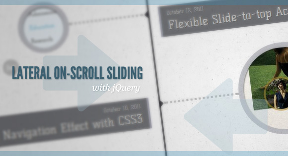
After getting the request, we are going to show you how to create a “slide-in on scroll” effect. You’ve probably seen this cool effect on some websites, like on Nizo or in the portfolio section of brilliantly designed La Moulade. The main idea is to laterally slide in elements depending on the scroll position of the document. Dividing the page into a left and right side, we want to move the elements from “outside” of the page to the center when they are in the viewport. We will also add the option to move the elements in 3D space.
收到请求后,我们将向您展示如何创建“滚动插入”效果。 您可能已经在某些网站上看到了这种酷效果,例如Nizo或设计精美的La Moulade的作品集部分。 主要思想是根据文档的滚动位置在元素上横向滑动。 将页面分为左侧和右侧,我们希望将元素在视口中时从页面的“外部”移动到中心。 我们还将添加在3D空间中移动元素的选项。
The theme of today’s tutorial is going to be a timeline where we will have some circular elements on one side and the descriptions on the other. We’ll be alternating the sides to create a random look.
今天的教程的主题将是一个时间轴,我们将在一侧有一些圆形元素,而在另一侧有描述。 我们将交替改变侧面以创建随机外观。
So, let’s start!
所以,让我们开始吧!
标记 (The Markup)
The HTML structure is going to consist of a main container and some rows that we’ll use to place the left and the right elements. The left and right elements will either contain a h2 heading, a circular link with a background image or a description in form of a h3 element with a link and a span:
HTML结构将由一个主容器和一些行组成,我们将使用这些行来放置左右元素。 左右元素将包含h2标题,带有背景图像的圆形链接或带有链接和范围的h3元素形式的描述:
<div id="ss-container" class="ss-container">
	<div class="ss-row">
		<div class="ss-left">
			<h2 id="november">November</h2>
		</div>
		<div class="ss-right">
			<h2>2011</h2>
		</div>
	</div>
	<div class="ss-row ss-medium">
		<div class="ss-left">
			<a href="#" class="ss-circle ss-circle-1">Some title</a>
		</div>
		<div class="ss-right">
			<h3>
				<span>November 28, 2011</span>
				<a href="#">Some Title</a>
			</h3>
		</div>
	</div>
	<!-- more rows... -->
</div>
For the circles we’ll have three different sizes and we’ll indicate that but giving the respective row the class of “ss-small”, “ss-medium” or “ss-large”. Let’s look at the style.
对于圆圈,我们将使用三种不同的大小,并指出这一点,但给相应的行指定“ ss-small”,“ ss-medium”或“ ss-large”类。 让我们看一下样式。
CSS (The CSS)
The container will occupy all the width and we’ll set the overflow to hidden because we don’t want a scrollbar to appear when we move the left and right elements out of if:
容器将占据所有宽度,我们将溢出设置为隐藏,因为当我们将左右元素移出if时,我们不希望出现滚动条:
.ss-container{
    width: 100%;
    position: relative;
    text-align: left;
    float: left;
	overflow: hidden;
	padding-bottom: 500px;
}
To create the middle line throughout the container, we’ll use a pseudo element that we’ll position in the middle of the container:
为了在整个容器中创建中间线,我们将使用一个伪元素,将其放置在容器的中间:
.ss-container:before{
    position: absolute;
    width: 4px;
    background: rgba(17,17,22,0.8);
    top: 0px;
    left: 50%;
	margin-left: -2px;
    content: '';
    height: 100%;
}
The row will serve as a wrapper for the left and right elements:
该行将用作左右元素的包装:
.ss-row{
    width: 100%;
    clear: both;
    float: left;
    position: relative;
    padding: 30px 0;
}
The two lateral elements will occupy half of the width:
这两个横向元素将占据一半的宽度:
.ss-left, .ss-right{
    float: left;
    width: 48%;
    position: relative;
}
.ss-right{
    padding-left: 2%;
}
.ss-left{
    text-align: right;
    float: left;
    padding-right: 2%;
}
The headings will have the following style:
标题将具有以下样式:
.ss-container h2{
    font-size: 40px;
    text-transform: uppercase;
    color: rgba(78,84,123,0.2);
	text-shadow: 0px 1px 1px #fff;
	padding: 20px 0px;
}
.ss-container h3{
    margin-top: 34px;
	padding: 10px 15px;
	background: rgba(26, 27, 33, 0.6);
	text-shadow: 1px 1px 1px rgba(26, 27, 33, 0.8)
}
To create a circle, we’ll set the border radius of the anchor to 50% and we’ll add some neat box shadow:
要创建一个圆,我们将锚的边界半径设置为50%,并添加一些整齐的框阴影:
.ss-circle{
    border-radius: 50%;
    overflow: hidden;
    display: block;
    text-indent: -9000px;
    text-align: left;
    box-shadow:
		0px 2px 5px rgba(0,0,0,0.7) inset,
		0px 0px 0px 12px rgba(61,64,85,0.3);
	background-size: cover;
	background-color: #f0f0f0;
	background-repeat: no-repeat;
	background-position: center center;
}
We’ll have three different circle sizes and depending on which side we are we’ll make the circle float either left or right:
我们将使用三种不同的圆大小,并根据我们在哪一侧的角度使圆向左或向右浮动:
.ss-small .ss-circle{
	width: 100px;
	height: 100px;
}
.ss-medium .ss-circle{
	width: 200px;
	height: 200px;
}
.ss-large .ss-circle{
	width: 300px;
	height: 300px;
}
.ss-left .ss-circle{
    float: right;
    margin-right: 30%;
}
.ss-right .ss-circle{
    float: left;
    margin-left: 30%;
}
We’ll use the pseudo element :before and :after in order to create the line and the arrow that will point to the middle line. The width will be defined as a percentage so that it adjust to the screen size. We’ll also center it by setting the top to 50% and correct the position by setting the margin-top to -3px. Depending on where we are (left or right side) we want the position to be different:
我们将使用伪元素:before和:after来创建线和指向中间线的箭头。 宽度将定义为百分比,以便调整为屏幕尺寸。 我们还将顶部设置为50%来居中,并通过将margin-top设置为-3px来校正位置。 根据我们所在的位置(左侧或右侧),我们希望位置不同:
.ss-circle-deco:before{
	width: 29%;
	height: 0px;
	border-bottom: 5px dotted #ddd;
	border-bottom: 5px dotted rgba(17, 17, 22, 0.3);
	box-shadow: 0px 1px 1px #fff;
	position: absolute;
	top: 50%;
	content: '';
	margin-top: -3px;
}
.ss-left .ss-circle-deco:before{
    right: 2%;
}
.ss-right .ss-circle-deco:before{
    left: 2%;
}
The little arrow will be created by the border style and depending on if it’s a child of the left or right side, we’ll set the according border and position:
小箭头将由边框样式创建,并且取决于它是左侧还是右侧的子项,我们将设置相应的边框和位置:
.ss-circle-deco:after{
	width: 0px;
	height: 0px;
	border-top: 10px solid transparent;
    border-bottom: 10px solid transparent;
	content: '';
	position: absolute;
	top: 50%;
	margin-top: -10px;
}
.ss-left .ss-circle-deco:after{
	right: 0;
	border-right: 10px solid rgba(17,17,22,0.8);
}
.ss-right .ss-circle-deco:after{
	left: 0;
	border-left: 10px solid rgba(17,17,22,0.8);
}
Because of the different circle sizes, we’ll need to adjust the position of the headings on the other side. We want them to be at the height of the arrow, so we’ll set the margins differently (the one for ss-small is already set in the circle itself):
由于圆的大小不同,我们需要调整另一侧标题的位置。 我们希望它们位于箭头的高度,因此我们将以不同的方式设置边距(用于ss-small的边距已在圆自身中设置):
.ss-container .ss-medium h3{
	margin-top: 82px;
}
.ss-container .ss-large h3{
	margin-top: 133px;
}
.ss-container .ss-left h3{
	border-right: 5px solid rgba(164,166,181,0.8);
}
.ss-container .ss-right h3{
	border-left: 5px solid rgba(164,166,181,0.8);
}
The style for the description:
说明的样式:
.ss-container h3 span{
    color: rgba(255,255,255,0.8);
    font-size: 13px;
    display: block;
    padding-bottom: 5px;
}
.ss-container h3 a{
    font-size: 28px;
    color: rgba(255,255,255,0.9);
    display: block;
}
.ss-container h3 a:hover{
	color: rgba(255,255,255,1);
}
Each circle is going to have a different background image:
每个圆圈将具有不同的背景图片:
.ss-circle-1{
    background-image:url(../images/1.jpg);
}
.ss-circle-2{
    background-image: url(../images/2.jpg);
}
.ss-circle-3{
    background-image: url(../images/3.jpg);
}
/* and so on... */
And that’s all the style! Let’s take a look at the JavaScript.
这就是所有样式! 让我们看一下JavaScript。
JavaScript (The JavaScript)
The main idea is to initially show all the side elements that are visible on the viewport. All the other elements will be hidden by setting their left or right value to -50%. If the perspective option is set to true, then these elements will be translated and rotated on the y-axis, with the opacity set to 0. On scroll, we want to show the lateral elements by sliding them to position 0 (left or right, respectively), or in case of perspective, translate / rotate them accordingly once they are in the viewport.
主要思想是首先显示在视口上可见的所有侧面元素。 通过将它们的左或右值设置为-50%,所有其他元素将被隐藏。 如果Perspective选项设置为true,则这些元素将在y轴上平移和旋转,并且不透明度设置为0。在滚动时,我们希望通过将横向元素滑动到位置0(左或右)来显示它们。 ),或者在使用透视图的情况下,将它们放入视口后相应地进行平移/旋转。
Let’s start by defining some variables:
让我们从定义一些变量开始:
	// the row elements
var $rows			= $('#ss-container > div.ss-row'),
	// we will cache the inviewport
	// rows and the outside viewport rows
	$rowsViewport, $rowsOutViewport,
	// navigation menu links
	$links			= $('#ss-links > a'),
	// the window element
	$win			= $(window),
	// we will store the window sizes here
	winSize			= {},
	// used in the scroll setTimeout function
	anim			= false,
	// page scroll speed
	scollPageSpeed	= 2000 ,
	// page scroll easing
	scollPageEasing = 'easeInOutExpo',
    // perspective?
    hasPerspective	= true,
    perspective	= hasPerspective && Modernizr.csstransforms3d,
We’ll have the following functions:
我们将具有以下功能:
// initialize function
init			= function() {
	// get window sizes
	getWinSize();
	// initialize events
	initEvents();
	// define the inviewport selector
	defineViewport();
	// gets the elements that match the previous selector
	setViewportRows();
	// if perspective add css
	if( perspective ) {
		$rows.css({
			'-webkit-perspective'		: 600,
			'-webkit-perspective-origin'	: '50% 0%'
		});
	}
	// show the pointers for the inviewport rows
	$rowsViewport.find('a.ss-circle').addClass('ss-circle-deco');
	// set positions for each row
	placeRows();
},
defineViewport defines a selector that gathers the row elements that are initially visible. An element is visible if its top is less than the window’s height. These elements will not be affected when scrolling the page:
defineViewport定义一个选择器,该选择器收集最初可见的行元素。 如果元素的顶部小于窗口的高度,则该元素可见。 滚动页面时,这些元素不会受到影响:
defineViewport	= function() {

	$.extend( $.expr[':'], {

		inviewport	: function ( el ) {
			if ( $(el).offset().top < winSize.height ) {
				return true;
			}
			return false;
		}

	});

},
setViewportRows checks which rows are initially visible:
setViewportRows检查哪些行最初是可见的:
setViewportRows	= function() {

	$rowsViewport 		= $rows.filter(':inviewport');
	$rowsOutViewport	= $rows.not( $rowsViewport )

},
getWinSize gets the window width and height:
getWinSize获取窗口的宽度和高度:
getWinSize		= function() {

	winSize.width	= $win.width();
	winSize.height	= $win.height();

},
And now let's initialize some events:
现在让我们初始化一些事件:
	initEvents		= function() {

		// navigation menu links.
		// scroll to the respective section.
		$links.on( 'click.Scrolling', function( event ) {

			// scroll to the element that has id = menu's href
			$('html, body').stop().animate({
				scrollTop: $( $(this).attr('href') ).offset().top
			}, scollPageSpeed, scollPageEasing );

			return false;

		});

		$(window).on({
			// on window resize we need to redefine
			// which rows are initially visible
			// (this ones we will not animate).
			'resize.Scrolling' : function( event ) {

				// get the window sizes again
				getWinSize();
				// redefine which rows are initially
				// visible (:inviewport)
				setViewportRows();
				// remove pointers for every row
				$rows.find('a.ss-circle').removeClass('ss-circle-deco');
				// show inviewport rows and respective pointers
				$rowsViewport.each( function() {

					$(this).find('div.ss-left')
						   .css({ left   : '0%' })
						   .end()
						   .find('div.ss-right')
						   .css({ right  : '0%' })
						   .end()
						   .find('a.ss-circle')
						   .addClass('ss-circle-deco');

				});

			},
			// when scrolling the page change
			// the position of each row
			'scroll.Scrolling' : function( event ) {

				// set a timeout to avoid that the
				// placeRows function gets called on
				// every scroll trigger
				if( anim ) return false;
				anim = true;
				setTimeout( function() {

					placeRows();
					anim = false;

				}, 10 );

			}
		});

	},
placeRows sets the position of the rows (left and right row elements). Both of these elements will start with -50% for the left/right (not visible). This value should be 0% (final position) when the element is in the center of the window.
placeRows设置行的位置(左和右行元素)。 这两个元素的左/右均以-50%开头(不可见)。 当元素位于窗口中心时,该值应为0%(最终位置)。
placeRows		= function() {
		// how much we scrolled so far
	var winscroll	= $win.scrollTop(),
		// the y value for the center of the screen
	winCenter	= winSize.height / 2 + winscroll;

	// for every row that is not inviewport
	$rowsOutViewport.each( function(i) {

		var $row	= $(this),
			// the left side element
			$rowL	= $row.find('div.ss-left'),
			// the right side element
			$rowR	= $row.find('div.ss-right'),
			// top value
			rowT	= $row.offset().top;

		// hide the row if it is under the viewport
		if( rowT > winSize.height + winscroll ) {

			if( perspective ) {

				$rowL.css({
					'-webkit-transform'	: 'translate3d(-75%, 0, 0) rotateY(-90deg) translate3d(-75%, 0, 0)',
					'opacity'			: 0
				});
				$rowR.css({
					'-webkit-transform'	: 'translate3d(75%, 0, 0) rotateY(90deg) translate3d(75%, 0, 0)',
					'opacity'			: 0
				});

			}
			else {

				$rowL.css({ left 		: '-50%' });
				$rowR.css({ right 		: '-50%' });

			}

		}
		// if not, the row should become visible
		// (0% of left/right) as it gets closer to
		// the center of the screen.
		else {

				// row's height
			var rowH	= $row.height(),
				// the value on each scrolling step
				// will be proporcional to the distance
				// from the center of the screen to its height
				factor 	= ( ( ( rowT + rowH / 2 ) - winCenter ) / ( winSize.height / 2 + rowH / 2 ) ),
				// value for the left / right of each side of the row.
				// 0% is the limit
				val		= Math.max( factor * 50, 0 );

			if( val <= 0 ) {

				// when 0% is reached show the pointer for that row
				if( !$row.data('pointer') ) {

					$row.data( 'pointer', true );
					$row.find('.ss-circle').addClass('ss-circle-deco');

				}

			}
			else {

				// the pointer should not be shown
				if( $row.data('pointer') ) {

					$row.data( 'pointer', false );
					$row.find('.ss-circle').removeClass('ss-circle-deco');

				}

			}

			// set calculated values
			if( perspective ) {

				var	t = Math.max( factor * 75, 0 ),
					r = Math.max( factor * 90, 0 ),
					o = Math.min( Math.abs( factor - 1 ), 1 );

				$rowL.css({
					'-webkit-transform'	: 'translate3d(-' + t + '%, 0, 0) rotateY(-' + r + 'deg) translate3d(-' + t + '%, 0, 0)',
					'opacity'           : o
				});
				$rowR.css({
					'-webkit-transform'	: 'translate3d(' + t + '%, 0, 0) rotateY(' + r + 'deg) translate3d(' + t + '%, 0, 0)',
					'opacity'		: o
				});

			}
			else {

				$rowL.css({ left 	: - val + '%' });
				$rowR.css({ right 	: - val + '%' });

			}

		}

	});

};

return { init : init };
演示版(Demos)
Check out the two demos, one with the "normal" slide in and one with the 3D sliding:
查看以下两个演示,一个演示带“普通”幻灯片,另一个演示带3D幻灯片:
And that's it! I hope you enjoyed this tutorial and find it useful!
就是这样! 我希望您喜欢本教程并发现它有用!
翻译自: https://tympanus.net/codrops/2011/12/05/lateral-on-scroll-sliding-with-jquery/
jquery横向滚动

魔乐社区(Modelers.cn) 是一个中立、公益的人工智能社区,提供人工智能工具、模型、数据的托管、展示与应用协同服务,为人工智能开发及爱好者搭建开放的学习交流平台。社区通过理事会方式运作,由全产业链共同建设、共同运营、共同享有,推动国产AI生态繁荣发展。
更多推荐

 0
0 0
0- 0


 已为社区贡献8条内容

所有评论(0)