css3D视觉差形成立体近慢与实现滚轮滚动页面逐渐出现内容效果
·
1.前端实现滚轮滚动页面逐渐出现内容效果
css
效果如下
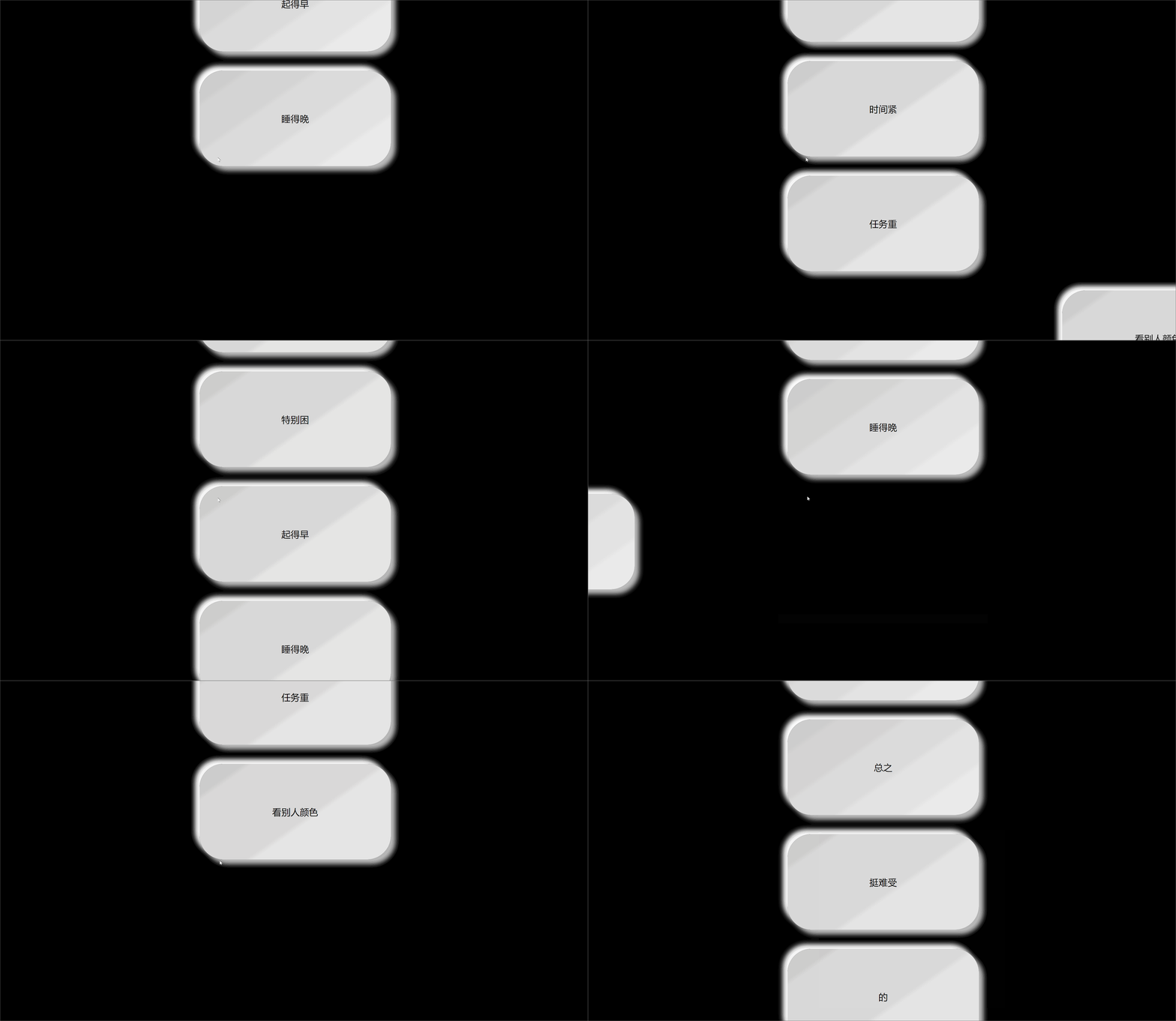
 <style>
        * {
            margin: 0;

        }
        #back {
            padding-top: 20px;
            background-color: black;
            overflow: hidden;
        }

        #back>div {
            display: flex;
            align-items: center;
            justify-content: center;
            font-size: larger;
            height: 200px;
            width: 400px;
            margin: 40px auto;
            border-radius: 50px;
            background: linear-gradient(145deg, #cacaca, #f0f0f0);
            box-shadow: 10px 10px 10px #bebebe,
                -10px -10px 10px #ffffff;
            transition: all .4s ease-in-out;
        }

        .box {
            transform: translateX(400%);
        }

        .box:nth-of-type(even) {
            transform: translateX(-400%);
        }

        .show {
            transform: translateX(0%) !important;
        }

    </style>
html
 <div id="back">
        <div class="box">在这里,你睡不好</div>
        <div class="box">吃不好</div>
        <div class="box">特别困</div>
        <div class="box">起得早</div>
        <div class="box">睡得晚</div>
        <div class="box">管理严</div>
        <div class="box">时间紧</div>
        <div class="box">任务重</div>
        <div class="box">看别人颜色</div>
        <div class="box">总之</div>
        <div class="box">挺难受</div>
        <div class="box">的</div>
        <div class="box">真的</div>
        <div class="box">真的</div>
        <div class="box">真真的</div>
        <div class="box">新生</div>
        <div class="box">你快跑</div>
        <div class="box">快跑</div>
        <div class="box">快跑啊</div>
        <div class="box">既然你能看到这,就说明你适合我们,来吧,你合格了</div>
    </div>
js
 const box = document.getElementsByClassName('box');
    const rest = window.innerHeight * 4 / 5;
    function appear() {
        Array.prototype.forEach.call(box, function (item) {
            const itemH = item.getBoundingClientRect().top;
            if (itemH < rest) {
                item.classList.add('show');
            }
            else {
                item.classList.remove('show');
            }
        });
    }
    window.addEventListener('scroll', () => {
        appear()

    })
    appear()
js值得注意的是getBoundingClientRect()这个函数
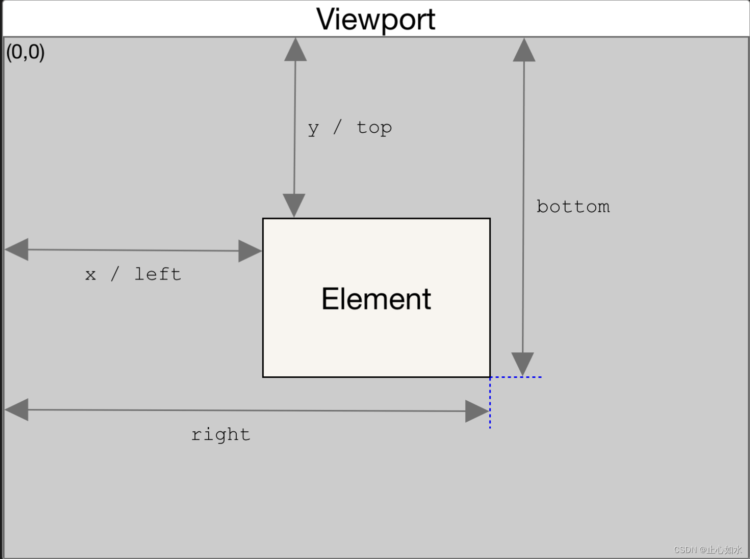
返回一个对象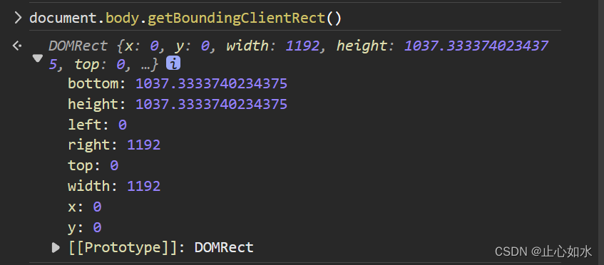
css3D视觉差形成立体近慢
对于css中可以利用3D视觉差形成立体近慢,远快的效果效果如下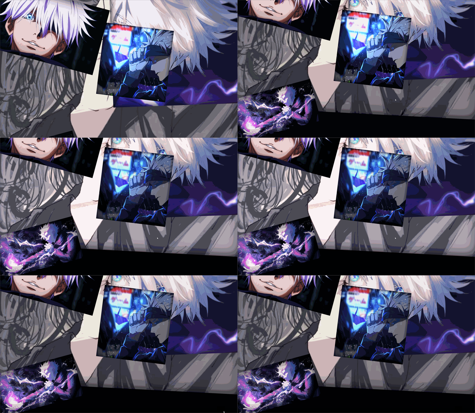
css
.g-parallax-container {
  width: 100vw;
  height: 100vh;
  overflow-y: scroll;
  overflow-x: hidden;
  perspective: 10px;
  transform-style: preserve-3d;
  background: black;
}

.g-parallax-container .basic_setting {
  background-size: cover;
  background-repeat: no-repeat;
  width: 100vw;
  height: 200%;
  position: absolute;
  top: 0px;
  box-shadow: 0px 0px 300px black inset;
  filter: brightness(100%);
}

.g-parallax-container .basic_setting:hover {
  filter: brightness(130%);
}

.g-parallax-container .item_1 {
  transform: translateZ(-1px) rotateZ(3deg);
  background-image: url(./img/5t5.jpg);
}

.g-parallax-container .item_2 {
  top: -20%;
  left: 43%;
  background-position: right;
  transform: translateZ(-10px) rotateZ(-2deg);
  background-image: url(./img/5t51.jpg);
}

.g-parallax-container .item_3 {
  top: 10%;
  left: 20%;
  transform: translateZ(-30px) rotateZ(7deg);
  background-image: url(./img/5t52.jpg);
}

.g-parallax-container .item_4 {
  top: 50%;
  left: -30%;
  width: 70vw;
  height: 70vh;
  background-size: 100% auto;
  transform: translateZ(-5px) rotateZ(15deg);
  background-image: url(./img/5t53.jpg);
}

.g-parallax-container .item_5 {
  outline: 0px;
  border: 0px;
  top: 180%;
  left: 5%;
  height: 30vh;
  width: 30vw;
  background-size: 100% auto;
  transform: rotateZ(-15deg);
  background-image: url(./img/5t54.jpg);
  background-size: cover;
}
html
<div class="g-parallax-container">
        <div class="item_1 basic_setting"></div>
        <div class="item_2 basic_setting"></div>
        <div class="item_3 basic_setting"></div>
        <div class="item_4 basic_setting"></div>
        <div class="item_5 basic_setting"></div>
    </div>
这个核心思想就是3D属性,父元素需要有
perspective: 10px;(视觉远近)
transform-style: preserve-3d;
子元素需要有
transform: translateZ(-10px) ;
来控制远近
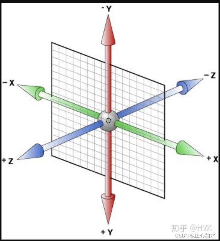
这是网上找的xyz的坐标图,在前端了与数学的坐标是不相同的

魔乐社区(Modelers.cn) 是一个中立、公益的人工智能社区,提供人工智能工具、模型、数据的托管、展示与应用协同服务,为人工智能开发及爱好者搭建开放的学习交流平台。社区通过理事会方式运作,由全产业链共同建设、共同运营、共同享有,推动国产AI生态繁荣发展。
更多推荐


 0
0 0
0- 0


 已为社区贡献1条内容

所有评论(0)