css 箭头_web前端入门到实战:css简单实现带箭头的边框
·

实现一个普通边框
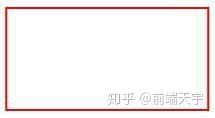
<style>
        .border {
            width: 100px;
            height: 50px;
            border: 1px solid red;
        }
    </style>
    <div class="border"></div>
实现由四个三角形组成的正方形
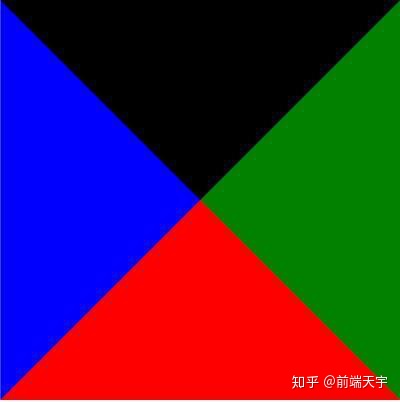
<style>
        .triangle {
            width: 0;
            height: 0;
            border: 100px solid red;
            border-right-color: green;
            border-left-color: blue;
            border-top-color: black;
        }
    </style>
    <div class="triangle"></div>
三角形
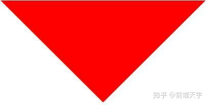
<style>
        .triangle-bottom {
            width: 0;
            height: 0;
            border: 100px solid transparent;
            border-top-color: red;
        }
    </style>
    <div class="triangle-bottom"></div>
将左右下边颜色设置为透明 transparent,得到向下的箭头
将三角形放入边框中
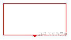
<style>
        .border-triangle {
            width: 100px;
            height: 50px;
            border: 1px solid red;
            position: relative;
        }

        .border-triangle:before {
            content: "";
            position: absolute;
            width: 0;
            height: 0;
            border: 4px solid transparent;
            border-top-color: red;
            left: 50%;
            margin-left: -4px;
            bottom: -8px;
        }
    </style>
    <div class="border-triangle"></div>
将三角形设置为绝对定位,利用margin-left和left 定位到元素中间,bottom设置-8px,靠近边框底部
遮住多余三角形
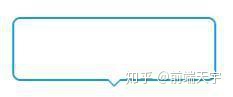
<style>
        .border-triangle-bottom {
            width: 100px;
            height: 30px;
            border: 1px solid #1d9cd6;
            position: relative;
            border-radius: 4px;
        }

        .border-triangle-bottom:after,
        .border-triangle-bottom:before {
            content: "";
            position: absolute;
            width: 0;
            height: 0;
            border: 4px solid transparent;
            border-top-color: #1d9cd6;
            left: 50%;
            margin-left: -4px;
            bottom: -8px;
        }

        .border-triangle-bottom:after {
            border-top-color: #fff;
            bottom: -7px;
        }
    </style>
    <div class="border-triangle-bottom"></div>
将边框颜色换成好看的蓝色,将before和after伪元素都设置为绝对定位,定位到边框底部剧中,将after伪元素设置成白色,底部偏移量大于before 1px,遮住三角形底部的颜色。这样一个好看的箭头边框就实现了
实战操作代码解析,更多web前端实战操作,学习指导,学习资源,点:前端技术分享

魔乐社区(Modelers.cn) 是一个中立、公益的人工智能社区,提供人工智能工具、模型、数据的托管、展示与应用协同服务,为人工智能开发及爱好者搭建开放的学习交流平台。社区通过理事会方式运作,由全产业链共同建设、共同运营、共同享有,推动国产AI生态繁荣发展。
更多推荐


 0
0 0
0- 0


 已为社区贡献9条内容

所有评论(0)